Tuesday 16 December 2014

Digipak Designs.

There are several examples of quite simple digipaks.


This is a nice fold and quite simple in design. 


This one has inspired me as I like the close ups and we can do this with our lead singer. 


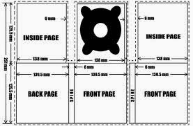
This is too cartoon in style and I think too simple. There is no information at all and as this is a promo pack, we need to really attract the Ta. 

Digipak Layout.

I have been researching templates for our digipak. We have to choose between 4 and 6 fold.


We are as yet undecided however we think we will go for a 4 pane digipak. We want to give the Ta enough information but not all.

Friday 5 December 2014

(GROUP POST) Ideas for our Ancillary Product.

Becka and I haven't yet decided if we are going to have a group shot of the band or a landscape photograph on our digipak so this is an idea Becka came up with if we don't use a photo of the band. This is a very quick sketch Becka did which could be replicated better on Adobe Elements 11 to make it look more professional as this is just a draft. This would be the band logo with a landscape photograph faded in the background.

Thursday 4 December 2014

Ancillary Products.

I've been looking at some digipaks for inspiration for our ancillary product. Obviously some are a bit dull and grungy, however there are some elements on them that could be used for mine and Becka's idea. 


Becka and I like this, as the logo for our band is a feather, we could replicate this kind of album cover with a feather. However, we need to create synergy so will also use a landscape shot taken during filming. We have also been inspired to desaturate this. 


We could so something like this using the sunset as that was one of our initial ideas. Even though You Me At Six is a totally different genre to our band. We like the idea of the sunset, and would be easy to photograph. 


We looked at this, as it is a band, and we like the idea of the head shots, we could have Becky in the middle and the boys either side.